Smart Shifts
Revamped design for a hospital shift scheduling MVP
Client:
Pyrgos public hospital
Role:
UX/UI Designer
Team
1 PM, 1 Developer
Year:
2023-2024

THE CHALLENGE
Modernising a public hospital’s scheduling system
In the fast-paced environment of public healthcare, paper-based shift scheduling is ineffective leading to admin overload, exhausted staff, and potential risks to patient care. Our team was contracted to develop a digital solution, that gives staff more time away from their screens so they can focus on providing better patient care. I was brought in before the final delivery, to redesign the MVP and make it more intuitive and user-friendly.
In the fast-paced environment of public healthcare, paper-based shift scheduling is ineffective leading to admin overload, exhausted staff, and potential risks to patient care. Our team was contracted to develop a digital solution, that gives staff more time away from their screens so they can focus on providing better patient care. I was brought in before the final delivery, to redesign the MVP and make it more intuitive and user-friendly.
In the fast-paced environment of public healthcare, paper-based shift scheduling is ineffective leading to admin overload, exhausted staff, and potential risks to patient care. Our team was contracted to develop a digital solution, that gives staff more time away from their screens so they can focus on providing better patient care. I was brought in before the final delivery, to redesign the MVP and make it more intuitive and user-friendly.
In the fast-paced environment of public healthcare, paper-based shift scheduling is ineffective leading to admin overload, exhausted staff, and potential risks to patient care. Our team was contracted to develop a digital solution, that gives staff more time away from their screens so they can focus on providing better patient care. I was brought in before the final delivery, to redesign the MVP and make it more intuitive and user-friendly.
THE SOLUTION
Intuitive shift management
I redesigned Smartshifts' MPV to make it faster and easier to use. I reorganised the information and improved user workflows, removing friction from shift management. I also updated the look of the app, making it cleaner and more organised, helping users work more efficiently with less confusion.
Enhanced efficiency with improved information architecture and user flows.
Enhanced efficiency with improved information architecture and user flows.
Increased usability by decluttering the user interface and reducing visual noise.
Increased usability by decluttering the user interface and reducing visual noise.
Improved app’s appeal by modernising its visual design and overall style.
Improved app’s appeal by modernising its visual design and overall style.

DISCOVER
For hospital employees every second counts
In busy hospitals, staff need reliable scheduling tools that work quickly and easily to keep everything organised. They need to see who's available right away and be able to set up and change schedules, to work together smoothly and give the patients the best care possible.

Maria Papanastasiou
Maria Papanastasiou
Maria Papanastasiou
Maria Papanastasiou
35, Doctor
35, Doctor
When...
Situation
Situation
Situation
Situation
When allocating staff for shifts
When I work consecutive shifts
When I have to update the payment scale of someone
When working with multiple departments
When I'm managing a critical case
I need to...
Motivation
Motivation
Motivation
Motivation
I need a clear overview of everyone's availability
I need a system that recognises and prevents over-scheduling
I would like to see a full list of all employees in my department
I need efficient shift schedule coordination
I need to quickly adjust the team's schedule
So that I can...
Expected outcome
Expected outcome
Expected outcome
Expected outcome
to ensure efficient and fair scheduling for all employees.
to safeguard my well-being and general patient safety.
so that I can access and edit their working information.
so that I can manage my shifts alongside other team members.
to ensure the right expertise is available at the right time.
Complex UX meets dated UI
To see how well the current MVP worked for staff and find ways to make it better, I did a comprehensive usability evaluation. The process revealed some critical issues: The app had tasks that were too complicated, it was hard to find your way around, and the interface looked messy and clattered.
1
Complex user flows
Complex user flows
Complex user flows
Unintuitive workflows make viewing and updating hospital staff shifts challenging.
Unintuitive workflows make it challenging the view and update of hospital stuff shifts.
2
Confusing navigation
Unclear labels and poorly
placed navigation destinations hinder users’ navigation.
3
Dated user interface
Default system elements increase visual noise, while all-caps reduce readability.
4
Cluttered Information
Excessive content overwhelms users, making it difficult to focus on essential task actions.
1
Complex user flows
Unintuitive workflows make viewing and updating hospital staff shifts challenging.
2
Confusing navigation
Unclear labels and poorly
placed navigation destinations hinder users’ navigation.
3
Dated user interface
Default system elements increase visual noise, while all-caps reduce readability.
4
Cluttered Information
Excessive content overwhelms users, making it difficult to focus on essential task actions.


Smart shifts MVP
Design goals
Efficient
Focusing on user flows and works than slots of information.
Simple
Reduce cognitive load, to help users easily focus on their tasks.
Reduce cognitive load, to help users focus on their tasks.
Consistent
Consistent design elements and interactions for user familiarity.
Consistent design and interactions for user familiarity.
Consistent design elements for user familiarity.
Efficient
Focusing on user flows and works than slots of information.
Simple
Reduce cognitive load, to help users easily focus on their tasks.
Consistent
Consistent design elements and interactions for user familiarity.
Simplifying admin stuff’s workflow
To fix the problems in navigation and user flows , I improved the way information was organised and how users move around the app. I rearranged things so similar features were grouped together, making it easier for users to find what they needed. I also made complicated tasks simpler by cutting out unnecessary steps, making it less confusing and quicker for hospital staff to get their work done.
To improve navigation and user flows , I rearranged the way information was organised and users moved around the app. I also grouped similar features together, making it easier to find things. I also cut unnecessary steps, to make it less confusing and quicker to use.
Simplifying admin stuff’s workflow
To fix the problems in navigation and user flows , I improved the way information was organised and how users move around the app. I rearranged things so similar features were grouped together, making it easier for users to find what they needed. I also made complicated tasks simpler by cutting out unnecessary steps, making it less confusing and quicker for hospital staff to get their work done.
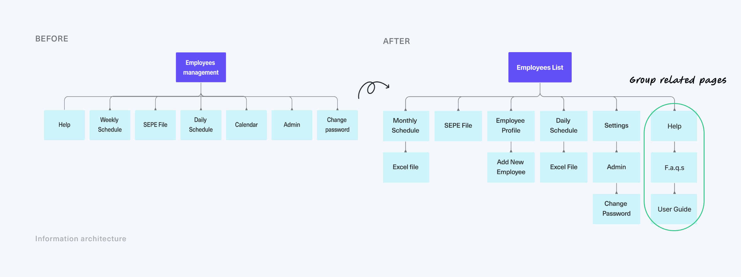

Information architecture
Log in user flow


Reducing cognitive load
I simplified the interface by removing unnecessary elements, to improve usability. I also grouped related information together, to make critical information stand out and help users see what's most important first. By limiting the options, it's quicker and easier for staff to make decisions, making shifts management more efficient.
I simplified the interface by removing unnecessary elements, to improve usability. I also grouped related information together, to make critical information stand out and help users see what's most important first. By limiting the options, it's quicker and easier for staff to make decisions, making shifts management more efficient
We removed extra stuff from the screen and grouped related information. This helps important information stand out. With fewer options, staff can make decisions faster.
I updated the app's appearance with a clean design and easy-to-read text, improving its usability. I added more white space to make critical information stand out and help hospital staff quickly scan information. I also used progressive disclosure to limit the available options at any given time, making quicker and easier for staff to make decisions.
1
Efficient navigation
Efficient navigation
Efficient navigation
Side navigation bar aligns
with natural reading patterns, allowing quicker info scanning.
Side menu aligns
with natural reading patterns, enabling quicker info scanning.
Unintuitive workflows make it challenging the view and update of hospital stuff shifts.
2
Clarity and hierarchy
Variations in color and contrast, and grouping lead users’ eye to the most important elements.
Variations in color and contrast, and lead users’ eye to the most important elements first.
3
Improved readability
Consistent typography, spacing, and alignment on data table, make data scanning easier.
4
Limiting distractions
A dedicated page for help and notifications reduces potential interruptions that break focus.
A dedicated page for help and notifications reduces potential interruptions that break focus.
1
Efficient navigation
Side navigation bar aligns
with natural reading patterns, allowing quicker info scanning.
2
Clarity and hierarchy
Variations in color and contrast, and grouping lead users’ eye to the most important elements.
3
Improved readability
Consistent typography, spacing, and alignment on data table, make data scanning easier.
4
Limiting distractions
A dedicated page for help and notifications reduces potential interruptions that break focus.
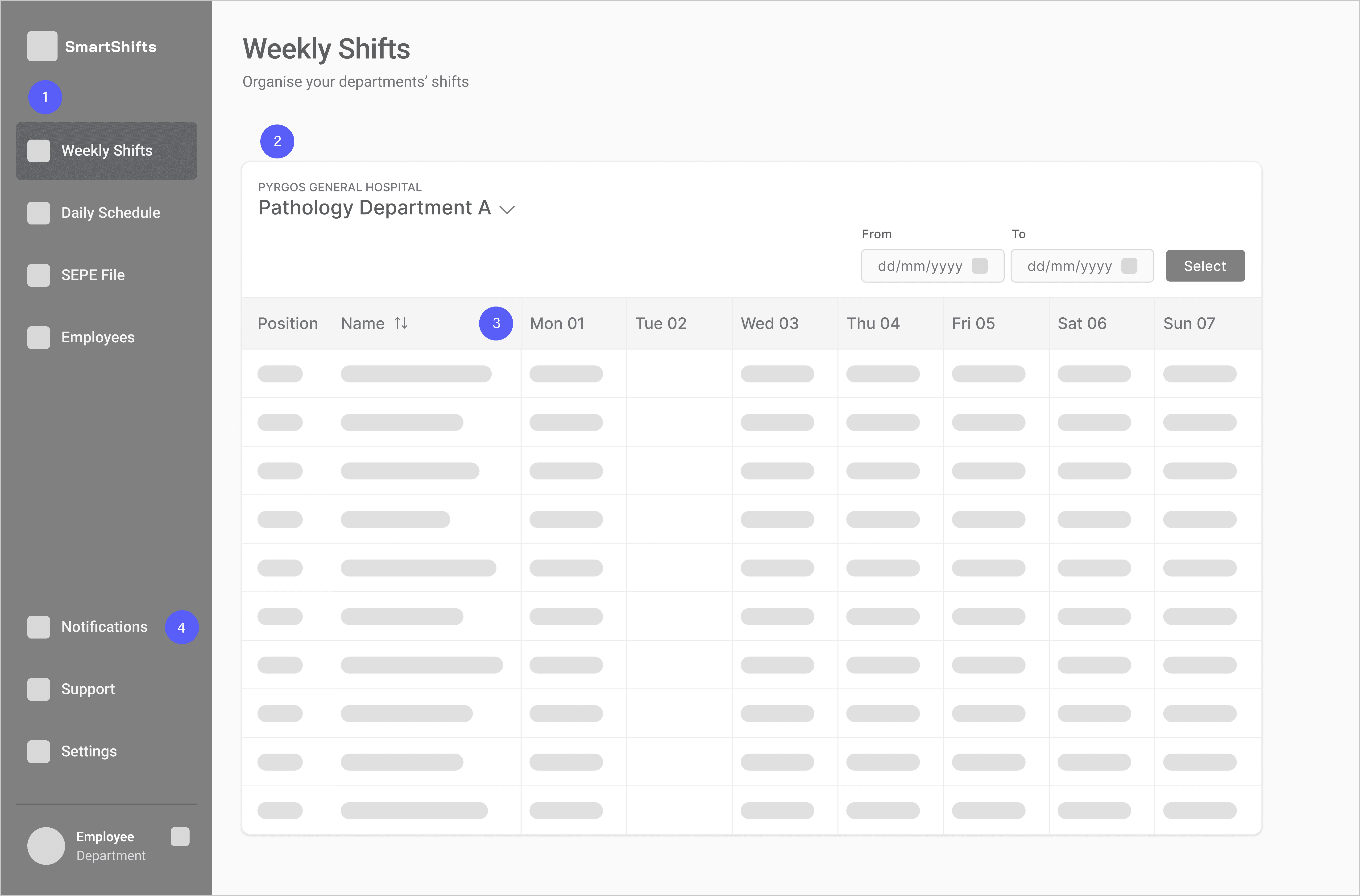

Weekly shifts wireframe
VISUAL DESIGN
Professional yet modern and accessible
To establish a clean and modern aesthetic that inspires trust, I refined all UI elements and used contemporary fonts and color palette. I also added ample white space on the interface, making it easier for healthcare workers to quickly scan and understand information when they're busy.
To establish a clean and modern aesthetic that inspires trust, I refined all UI elements and used contemporary fonts and color palette. I also added white space on the interface, making it easier for healthcare workers to quickly scan and understand information when they're busy.

Roboto
Aa
Regular
Medium
Bold
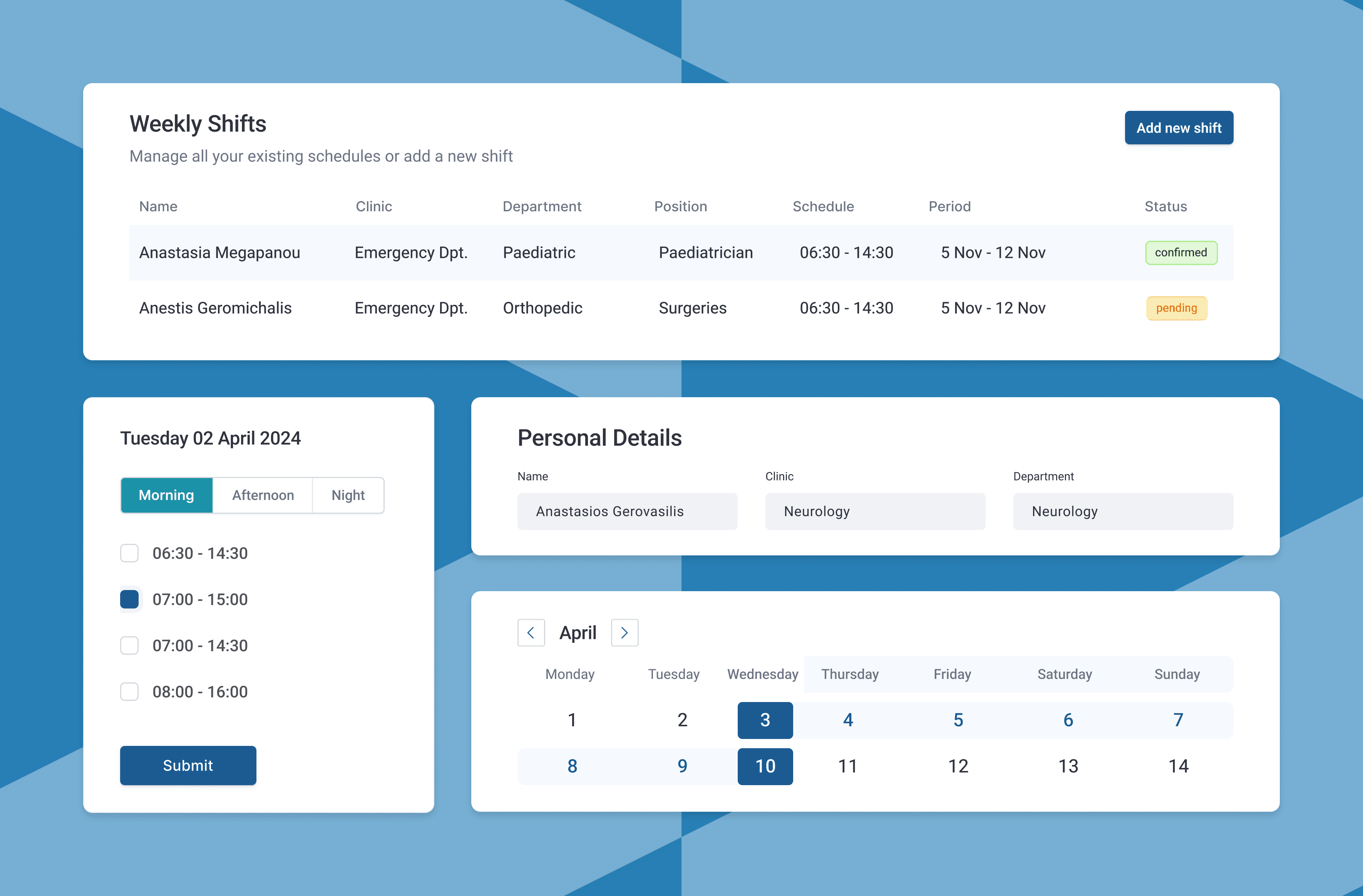
Tuesday 02 April 2024
Morning
Afternoon
Night
06:30 - 14:30
07:00 - 15:00
07:00 - 14:30
08:00 - 16:00
Submit
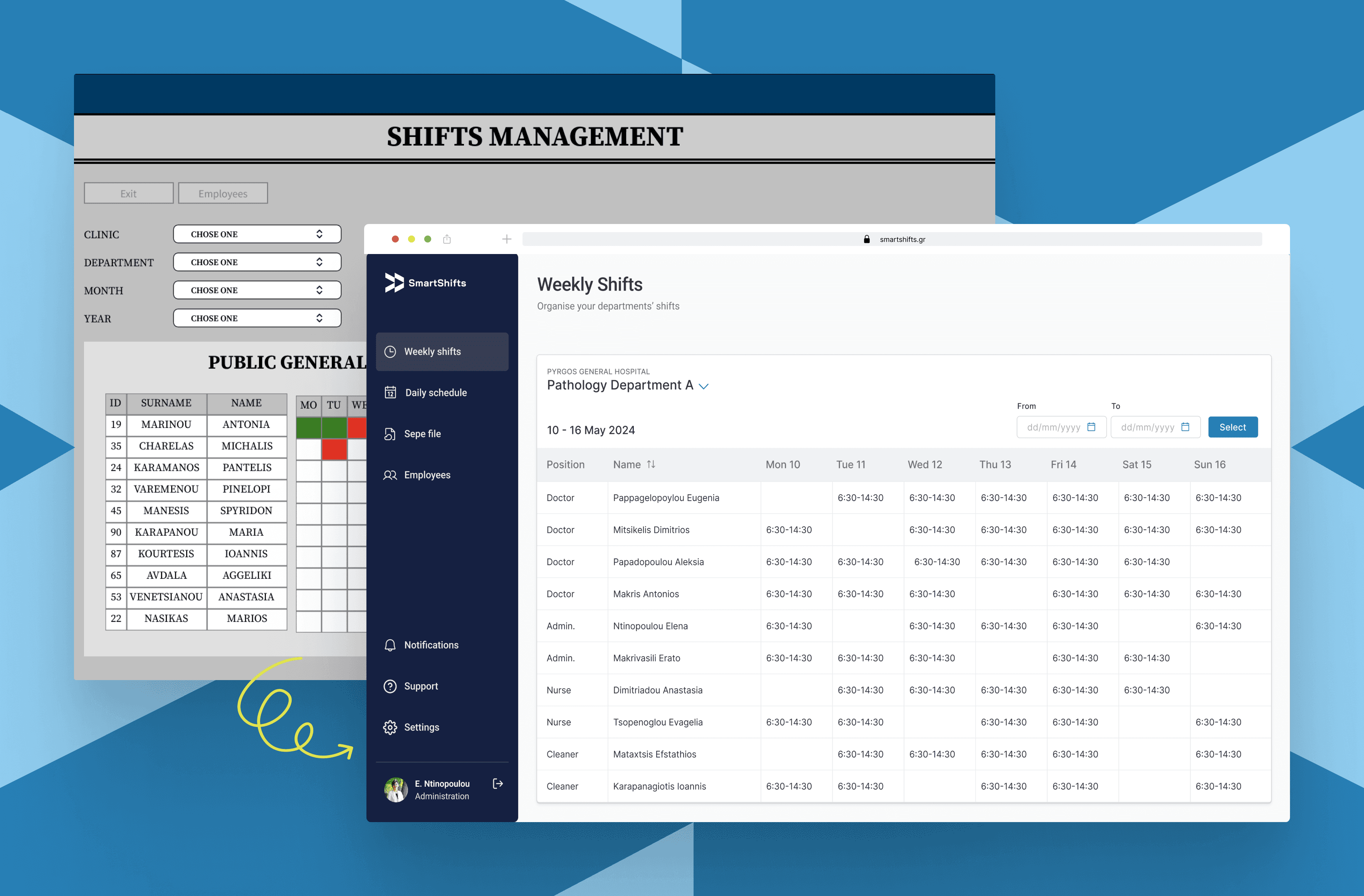
Weekly Shifts
Manage all your existing schedules or add a new shift
New schedule
Name
Position
Department
Schedule
Period
Status
Anastasia Megapanou
Paediatrician
Emergency Dpt.
06:30 - 14:30
5 Nov - 12 Nov
confirmed
Menelaos Karapanos
Pathologist
Emergency Dpt.
06:30 - 14:30
5 Nov - 12 Nov
pending

1
April
2024
Mo
Tu
We
Th
Fr
Sa
Su
1
2
3
4
5
6
7
8
9
10
11
12
13
14
DELIVERY
Effortless shift planning
The redesigned app makes scheduling staff much easier, cutting down on paperwork and admin tasks. Its intuitive interface balances simplicity and visual appeal, enabling effortless shift management. By helping healthcare workers get things done faster, the app saves them time they can spend on taking care of patients.
Effective organisation
of hospital workforce
Effective organisation of hospital workforce
Effective organisation of hospital workforce
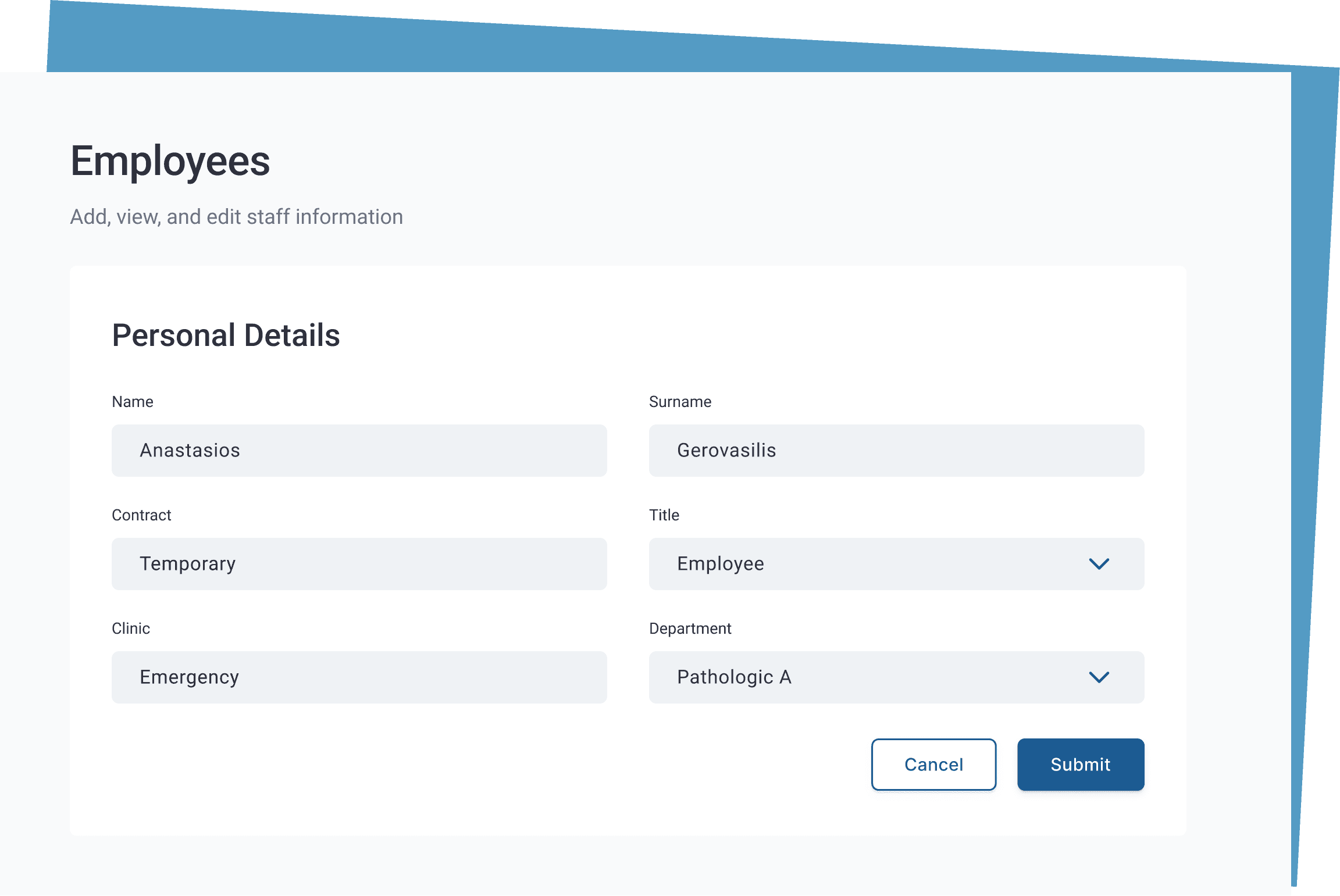
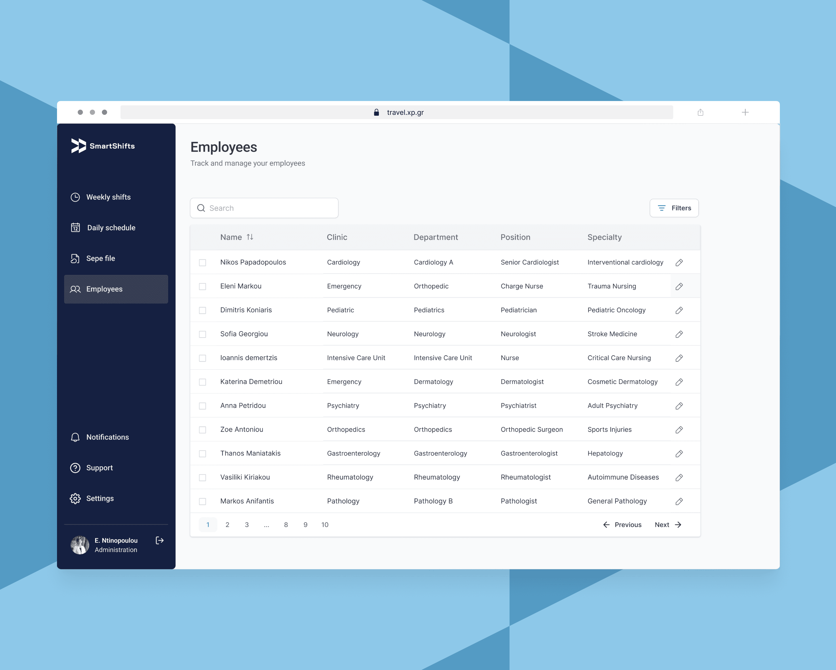
The updated employee database has a clean and organised layout, that makes it easy to quickly scan and spot important information like names, job titles, and departments.
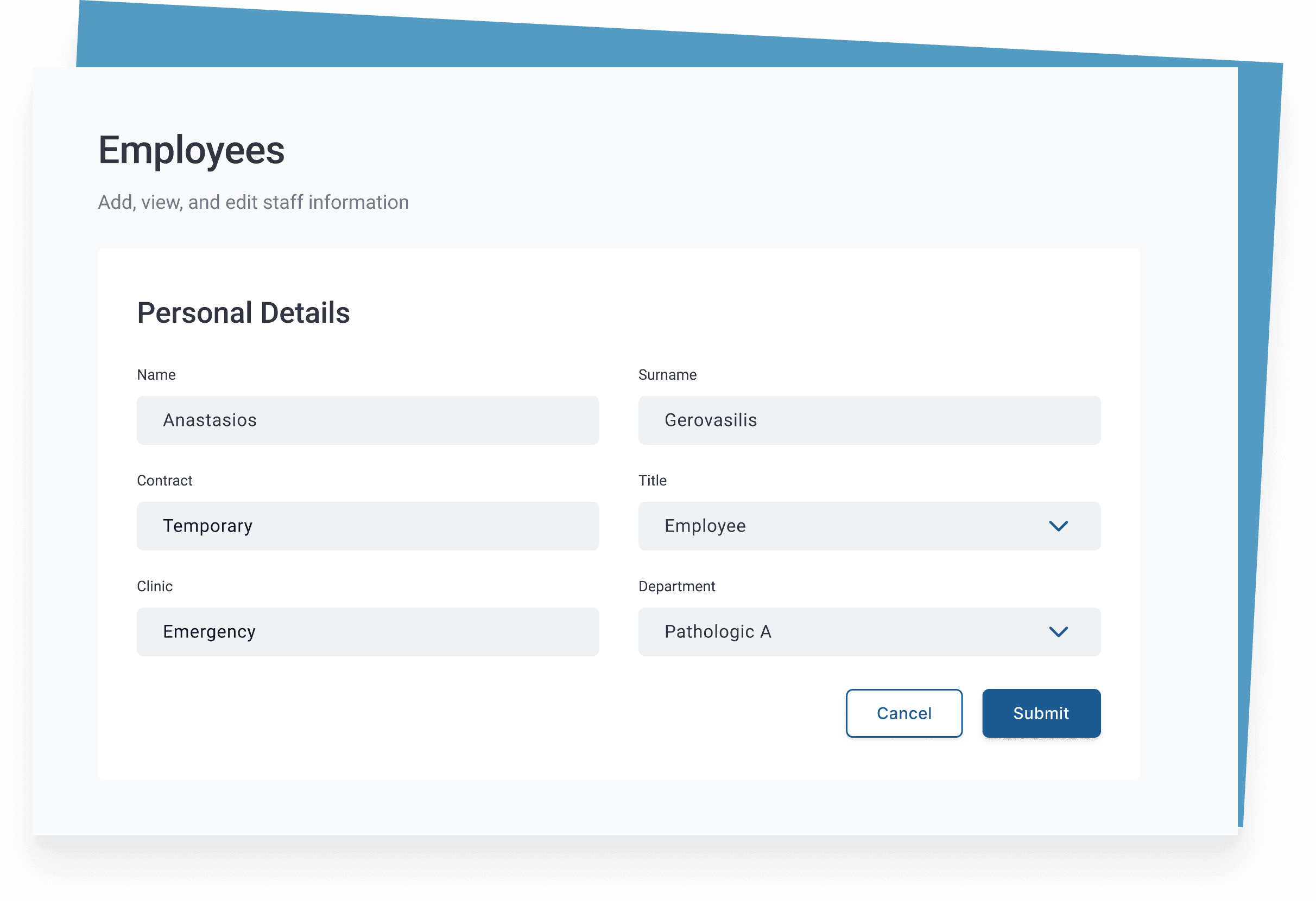
Employee card

Shift schedule
Clarity in reading,
simplicity in editing
Clarity in reading, simplicity in editing
Clarity in reading,
simplicity in editing
With a non-modal side panel (instead of a modal popup that would obscure information on the table) employees can quickly display and edit a single shift, while still being able to view the rest of the table’s data.
With a non-modal side panel (instead of a modal popup that would obscure information on the table) employees can quickly display and edit a single shift, while still being able to view the rest of the table’s data.
With a non-modal side panel (instead of a modal popup that would obscure information on the table) employees can quickly display and edit a single shift, while still being able to view the rest of the table’s data.
Seamless personnel record management
Employee data is strategically organized and presented, enabling users to quickly search, locate, and edit staff information. The user-friendly record card accelerates task completion and enhances scheduling efficiency.

Employees records
LEARNINGS
Small steps, big impact
Through this project, I learned the power of strategic, incremental improvements over a complete overhaul. By prioritising quick wins on key user tasks and applying the 80/20 rule, I achieved significant impact with minimal disruption. This approach taught me to aim for immediate improvements over cosmetic updates to improve user experience while aligning with project goals.

VISUAL DESIGN
Professional yet modern and accessible
To establish a clean and modern aesthetic that inspires trust, I refined all UI elements and used contemporary fonts and color palette. I also added ample white space on the interface, making it easier for healthcare workers to quickly scan and understand information when they're busy.
DELIVERY
Effortless shift planning
The redesigned app makes scheduling staff much easier, cutting down on paperwork and admin tasks. Its intuitive interface balances simplicity and visual appeal, enabling effortless shift management. By helping healthcare workers get things done faster, the app saves them time they can spend on taking care of patients.
Employee card
Effective organisation of hospital workforce
The updated employee database has a clean and organised layout, that makes it easy to quickly scan and spot important information like names, job titles, and departments.
Employees records

Clarity in reading, simplicity in editing
With a non-modal side panel (instead of a modal popup that would obscure information on the table) employees can quickly display and edit a single shift, while still being able to view the rest of the table’s data.
Employees records
Seamless personnel record management
Employee data is strategically organized and presented, enabling users to quickly search, locate, and edit staff information. The user-friendly record card accelerates task completion and enhances scheduling efficiency.
DELIVERY
Small steps, big impact
My redesign approach focused on incremental improvements over a major overhaul, applying the 80/20 rule to identify high-impact changes. Hence, I learned to identify opportunities for quick wins that enhance user experience, while also planning for more substantial changes where necessary. By prioritising key user tasks over fancy changes, I significantly improved user experience while aligning with project goals.